Unveiling Color Psychology in Interior Design: Crafting Your Home's Emotional Palette
- Anonymous
- Aug 29, 2023
- 6 min read
Updated: Apr 1, 2024

Introduction
Hey there! Today, we're diving deep into the fascinating world of color psychology in interior design. No frills, no fuss – just straight-up insights on how different colors affect our emotions and how you can use this knowledge to set the perfect mood in your home. Let's get down to the basics of color psychology and create the atmospheres you desire.
Colors are more than just pretty shades; they're like emotional triggers for our brains. In this section, we'll explore the basics of color psychology. Understand why certain colors make you feel calm, energized, or cozy. It's a bit like decoding a secret language of emotions through hues.
Colorful Emotions: The Emotional Impact of Colors
Here, we're going to dive into the emotional landscapes painted by different colors. For instance, blues can evoke serenity, while reds bring energy. Discover how to use this emotional power to your advantage. Want a soothing bedroom or an invigorating workspace? The choice of color is your superpower.
1. Cool and Calm: The Serenity of Cool Colors
Cool colors like blues and greens are like a breath of fresh air. They bring a sense of tranquility and spaciousness. We'll explore how to infuse your space with a soothing vibe using these calm colors. From bedrooms to living rooms, you'll learn how to create a serene escape.
Cooling Effects of Blue and Invoking Serenity with Green
Let's start with blue, the color of oceans and clear skies. Blue has this incredible ability to cool down a room's temperature – not literally, but in how it makes us feel. Now, let's turn our attention to green, the color of lush forests and meadows. Green brings a sense of calm, rejuvenation, and harmony to any space.
Step 1: Choose Your Shade
When aiming for a cool and calming vibe, opt for softer shades of blue like sky blue, pastel blue, or powder blue. These colors mimic the soothing effect of an endless blue sky.
You can also achieve a cool and calm ambiance with green, opt for soft and muted greens like sage, mint, or seafoam. These hues invoke the tranquility of a forest glade.
Step 2: Balance with Neutrals, Complement with Earthy Rones
Pair your chosen blue with neutral tones like whites, grays, or even light wooden furniture. This balance prevents the room from feeling too cold and keeps it cozy.
Pair your chosen green with earthy tones like brown or beige. This combination mimics the natural world and adds warmth to the space.
Step 3 for Blue: Embrace Natural Light
Allow natural light to flow into the space. Blue thrives when bathed in sunlight, creating a refreshing and airy atmosphere.
Step 3 for Green: Incorporate Greenery
Bringing in real or artificial plants not only enhances the green theme but also connects your space to the calming influence of nature.
2. Warm and Cozy: The Comfort of Warm Colors
Warm colors like reds, oranges, and yellows are the life of the party. They radiate energy and warmth. In this section, we'll show you how to bring lively vibes into your space. Think inviting dining rooms, cozy reading nooks, or kitchens that feel like the heart of your home.
Harnessing the Power of Red
Let's begin with red, the color of passion and energy. Red can add warmth and vibrancy to your space, making it feel alive.
Step 1: Select Your Shade
Opt for warmer shades of red like crimson, brick, or terracotta. These hues exude coziness and create a welcoming atmosphere.
Step 2: Use Red as an Accent
Red is intense, so use it sparingly as an accent color. Think red cushions, artwork, or a single piece of furniture to add that pop of energy.
Step 3: Create Balance
Balance the fiery red with neutral tones like white or beige. This prevents the room from feeling overwhelming and maintains a sense of harmony.
Infusing Warmth with Orange
Orange is a color that radiates warmth and enthusiasm. It's like a ray of sunshine in your space.
Step 1: Opt for Muted Oranges
For a cozy and energizing vibe, go for muted shades of orange like apricot, coral, or burnt orange. These tones are soothing yet invigorating.
Step 2: Use Orange Accents
Similar to red, use orange as accents. Consider orange throw pillows, a rug, or even an accent wall to add warmth.
Step 3: Blend with Neutrals
Pair orange with neutral tones like gray or beige. This combination strikes a balance between vibrancy and serenity.
Energizing with Lively Yellow
Yellow is like a burst of sunshine, infusing your space with positivity and energy.
Step 1: Go for Soft Yellows
Choose softer shades of yellow like buttercream, pale lemon, or soft mustard. These colors create a cheerful yet calming ambiance.
Step 2: Accentuate with Yellow
Use yellow as an accent color in accessories, such as curtains, cushions, or artwork. These pops of yellow can instantly brighten a room.
Step 3: Keep It Light and Airy
Pair yellow with light and airy colors like white or light gray to maintain a sense of openness and energy.
3. The Power of Neutrals: Versatile and Timeless
Neutrals might seem unassuming, but they're the unsung heroes of design. We'll uncover their power to provide a versatile backdrop for any mood. From minimalist elegance to cozy comfort, neutrals offer a timeless canvas for your creativity.
Choosing the Right Neutrals
Let's kick things off by understanding what neutral colors are. Think of whites, grays, beige, and soft browns. These hues are like a blank canvas waiting for your creative touch.
Step 1: Start with a Neutral Base
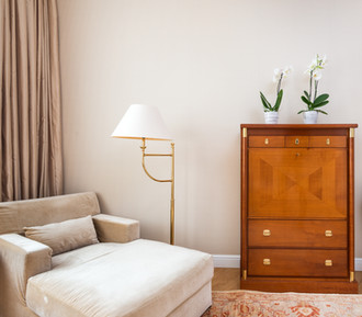
When aiming for a versatile and timeless space, consider using neutral colors as your base. Paint your walls in a soft gray, off-white, or a gentle beige. This neutral backdrop provides a timeless foundation.
Step 2: Complement with Neutral Tones
Extend the neutrality throughout your space with furniture and accessories. Opt for sofas, chairs, and tables in neutral shades. These pieces effortlessly blend into any design style and color scheme.
Step 3: Add Pops of Color
The beauty of neutrals is that they serve as a canvas for accents. Inject pops of color through cushions, artwork, or decorative items. This allows you to change the look of your space with ease whenever you desire.
Step 4: Embrace Texture and Patterns
To prevent neutrality from feeling bland, introduce texture and patterns. Think of a textured rug, patterned curtains, or a mix of materials like wood and metal. These elements add depth and character to your space.
Maintaining the Timeless Appeal
One of the key advantages of neutral colors is their timeless nature. They never go out of style, allowing your space to remain relevant for years to come.
Step 1: Focus on Quality
When choosing neutral furniture and decor, opt for quality pieces. These items tend to withstand the test of time both in terms of durability and style.
Step 2: Evolve with Trends
As design trends come and go, neutrals serve as a steady anchor. You can easily adapt to new styles by changing accessories and accents while keeping your neutral base intact.
Making a Statement: The Bold Impact of Accent Colors
Accent colors are like the exclamation marks in your design story. In this part, we'll delve into how to use bold colors to create striking focal points. A red chair, a vibrant artwork – these accents can add drama and personality to any space.
Step 1: Pick Your Bold Hero
First things first, choose the bold color that will steal the spotlight. Reds, deep blues, emerald greens, and vibrant yellows are fantastic choices. Think about the atmosphere you want to create.
Step 2: Accentuate a Wall
Painting a single wall in your chosen bold color can instantly create a striking focal point. It's like giving that wall a starring role in your design story.
Step 3: Make it Pop with Furniture
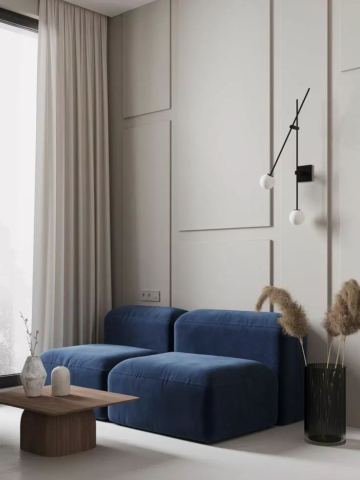
If painting a wall isn't an option, introduce bold colors through furniture. A vivid sofa, an eye-catching armchair, or a bold coffee table can be the star of the show.
Step 4: Artistic Accents
Decorative items can work wonders as focal points. Consider bold-colored artwork, throw pillows, or vases. These accents inject personality and drama without overwhelming the entire space.
Step 5: Layer with Neutrals
Balance is key. Surround your bold focal point with neutral tones like whites, grays, or beige. This creates a harmonious backdrop that lets the bold color shine.
Step 6: Lighting Matters
Don't forget about lighting. Well-placed spotlights or pendant lights can draw attention to your focal point, making it even more captivating.
Harmony in Hues: Creating Cohesion with Color Schemes
Now, it's time to put it all together. We'll guide you through the art of harmonizing colors. Discover color schemes, complementary hues, and the visual rhythms that make a space feel cohesive. By the end of this section, you'll be a color harmony virtuoso.
There you have it! You've uncovered the secrets of color psychology in interior design. Your home isn't just a place; it's an emotional canvas waiting for your artistic touch. So, pick your palette and start painting the perfect mood for your living spaces.


Comments